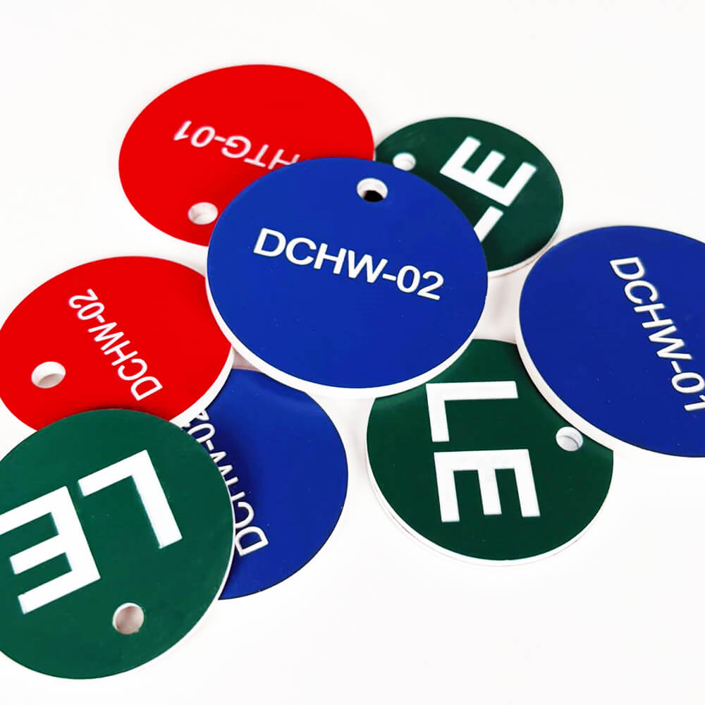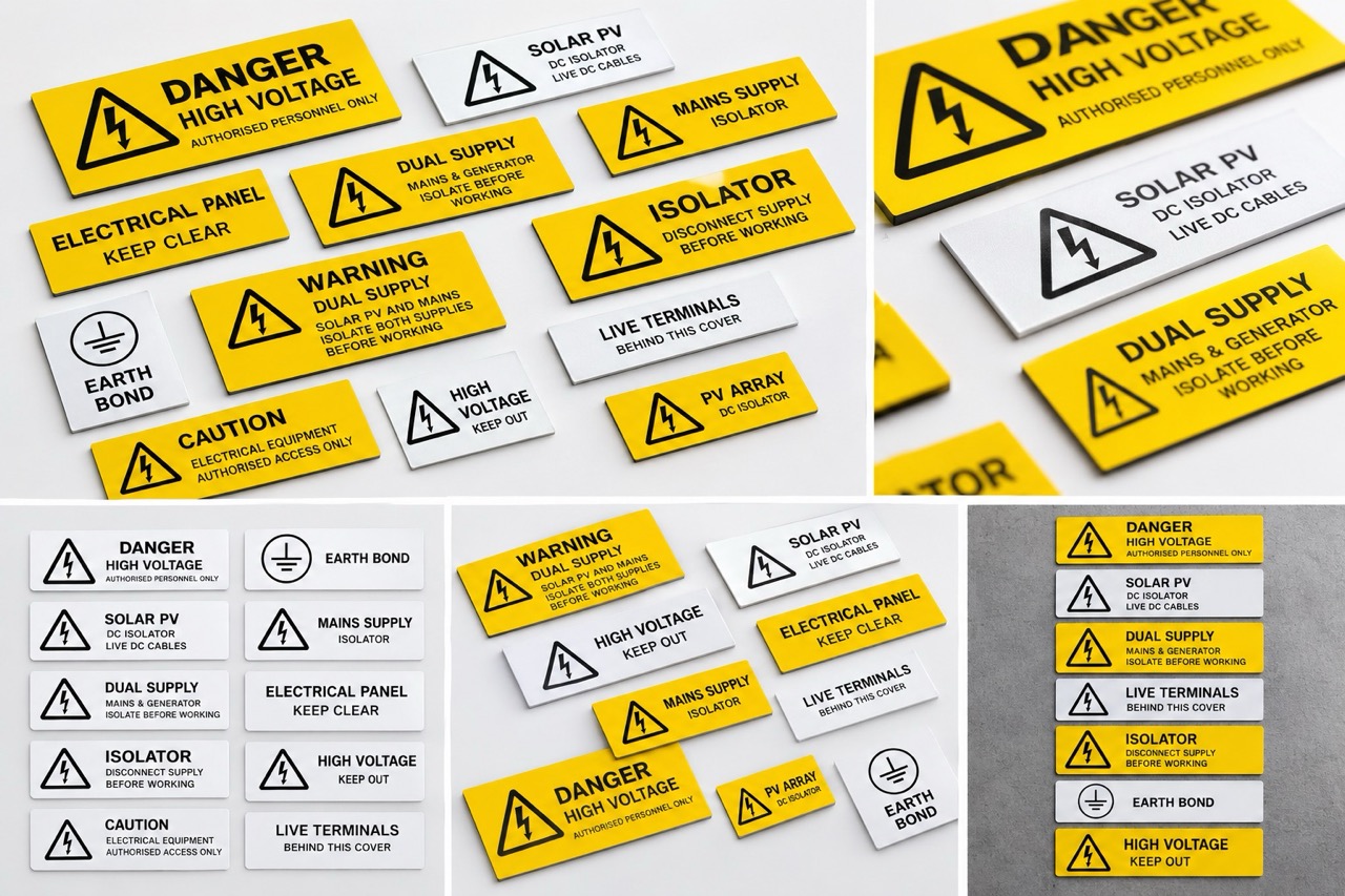
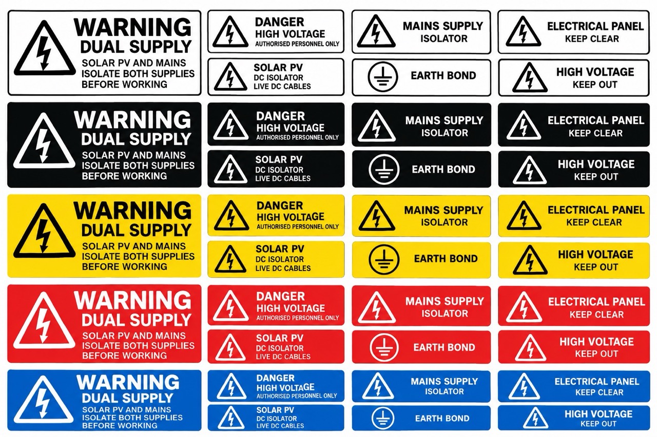
Every traffolyte label is a two colour decision. The surface cap layer provides the background, the core layer provides the lettering, and the combination you choose does more work than most specifiers realise. In industrial and electrical environments, colour is not a styling choice. It is a signalling system that maintenance personnel read before they read a single word.
This article explains the standard combinations, the conventions behind them and the practical details that make a colour schedule easy to get right first time. It expands on the colour section of our complete guide to traffolyte labels.
How Traffolyte Colours Work
Traffolyte is manufactured as a laminate with a coloured cap over a contrasting core. Engraving removes the cap to the depth of the core, so the background colour is the sheet surface and the text colour is the layer beneath. Colours are therefore specified in pairs, always background first. Black on white and white on black are different sheets, not the same sheet used differently, and a schedule that lists them ambiguously will produce the wrong labels.
The Standard Combinations and What They Mean
- Black on white and white on black. The general purpose workhorses for circuit identification, equipment labels and panel schedules. Highest legibility, no safety meaning attached, chosen mostly on contrast against the mounting surface.
- Yellow with black text. The hazard convention. Warning labels, caution notices and hazard identification across UK industry use this pairing, and personnel are trained to react to it on sight.
- Red with white text. Danger and prohibition. Danger of death signs, emergency stops, no entry and prohibition notices. The strongest signal in the system and the one to protect from casual use, because red labels applied decoratively dilute the meaning of every genuine one on site.
- Blue with white text. Mandatory instruction. PPE requirements, mandatory procedures and safety instructions that must be followed rather than merely noted.
- Green with white text. Safe condition. First aid points, escape routes, fire exits and safety equipment locations.
Where the Conventions Come From
The colour meanings follow ISO 7010, the international standard for safety signs, and they align with the framework UK health and safety signage regulations are built on. Following them is partly a compliance matter and mostly a recognition matter. Contractors and maintenance engineers move between sites constantly, and they arrive expecting hazard labels to be yellow, mandatory labels to be blue and prohibition labels to be red. A site that follows the conventions communicates instantly. A site that improvises makes every visitor stop and decode.
For general panel identification outside the safety categories, no convention applies and the choice is practical. Black on white suits light coloured enclosures, white on black suits dark ones, and consistency across an installation matters more than either choice.
Practical Details Worth Getting Right
- Contrast against the mounting surface. A white label on a white panel disappears at a glance even with perfectly engraved text. Consider the enclosure colour, not just the label in isolation.
- Lighting conditions. Plant rooms, risers and switch rooms are often poorly lit. High contrast combinations and generous character heights earn their keep in exactly these locations.
- Matching existing installations. Extensions to older sites usually look best and read most clearly when they continue the established colour scheme, provided that scheme respects the safety conventions.
- Writing the schedule. State the combination explicitly for every line, background first, and confirm any label carrying safety meaning against the conventions above before submission. Colour errors are the most avoidable reprint we see.
Specifying With Confidence
Colour is one of the simplest parts of a traffolyte specification to get right, and one of the most visible to get wrong. Stick to the conventions for anything with safety meaning, choose on contrast for everything else, and keep the scheme consistent across the installation.
Our complete guide to traffolyte labels covers the full specification checklist, from thickness and character height to fixing methods. For a colour schedule you would like a second pair of eyes on, get in touch and we will happily review it before production.